
BRAND COLLATERAL
BUSINESS CARD
2026
House of Varah
Transforming an existing brand identity into its first premium physical touchpoint.
TIMELINE
March 2026
CLIENT
House of Varah
ROLE
Visual Designer
SKILLS
Visual Design, Print Design, Indesign
THE CHALLENGE
Although the brand identity already existed, the card design started with a clean slate.
House Of Varah already had an established identity, including its logo, colour palette and brand vision. The founder had explored business card designs herself, but the initial print didn't capture the timeless, premium experience she wanted. My role was to transform that existing identity into a refined, print-ready business card for professional business interactions.
UNDERSTANDING THE VISION
Defining what 'premium' feels like in the palm of your hand.
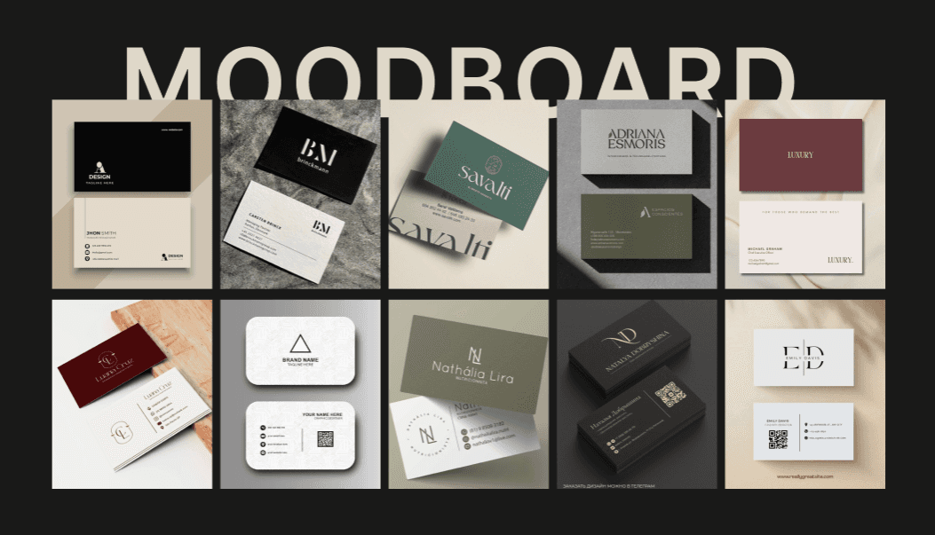
I explored multiple visual directions—including variations with both dark and light reverse sides—to understand how the brand could best communicate a premium presence in print.
Through several iterations with the founder, we refined the layout, hierarchy and overall composition before arriving at the final direction.


DESIGN CONSIDERATIONS
Extending the Brand Language
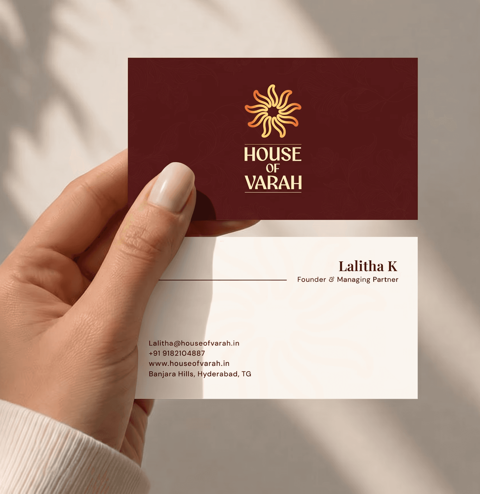
Instead of repeating the complete logo as a decorative element, I extracted the symbolic mark and introduced it as a subtle background detail. This added depth while allowing the logo and key information to remain the primary focus.
Balancing Luxury and Readability
Multiple layout, typography and colour combinations were explored before selecting a direction that felt timeless while remaining comfortable to read in real-world business interactions.
Designed for Production
The artwork was prepared with proper bleed, safe margins and print-ready specifications to ensure the final printed card preserved the intended quality, spacing and readability.
To ensure the card felt both luxurious and readable in real-world lighting, I paired Playfair Display for its elegant, timeless structure with body font DM Sana to maintain crisp legibility for the contact details at small print sizes.
Premium wasn't achieved through decoration—it came from thoughtful typography, generous spacing, subtle detailing and careful print preparation.
EXPLORING DIRECTIONS
Visual & Layout Explorations
I explored multiple visual directions—from light and dark themes to different information hierarchies, typography pairings and background treatments—before selecting the direction that best reflected the brand.


FINAL DIRECTION
A refined layout balancing aesthetics with readability.

Why this direction?
✓ Extended the existing brand identity instead of redesigning it.
✓ Used subtle organic patterns to introduce depth while keeping the logo as the primary focal point.
✓ Balanced premium aesthetics with readability for everyday business use.
PRINT OUTCOME
From digital concept to a tactile reality.
PROJECT OUTCOME
When successful delivery leads to continued collaboration

The successful delivery led to continued collaboration, with the client returning for another branding project.