
PRODUCT DESIGN
E- COMMERCE
2025
Denim
Can a data-heavy shopping experience still feel calm and easy to use?
TIMELINE
Jan–Feb 2026
PROJECT
Self-initiated Concept
ROLE
UI/UX Designer
SKILLS
UX Research, Information Architecture
WHY THIS PROJECT EXISTS?
Most concept UI projects look clean because they avoid complexity. Minimal data. Few decisions. Simple flows. Real e-commerce doesn't have that luxury.
Clothing interfaces are dense, choice-heavy, and often overwhelming. Fit, size, colour, fabric, pricing, availability — each variable adds to the decision load. Each unanswered question is a reason to hesitate, and hesitation in e-commerce means abandonment.
I set myself one question: can a data-heavy shopping experience still feel visually calm and easy to use?
This project was my attempt to answer it.
WHY D2C SPECIFICALLY?
I deliberately chose a Direct-to-Consumer model over a marketplace.
Unlike marketplaces, D2C brands live or die by how their product feels to use. The interface isn't just a store — it's the brand. Denim felt like the right product to test this. Specific enough to have real constraints. Complex enough to make the decisions interesting.
BEFORE DESIGNING ANYTHING
Rather than jumping straight into layouts, I started by studying how existing e-commerce platforms handled the same problems.
Not for visual inspiration. For pattern logic. Several things appeared consistently across platforms: filters were always prioritised early, product cards followed predictable information hierarchies, pricing relied heavily on visual contrast, CTAs maintained strong positional consistency.
One thing stood out even more.
Most homepages tried to communicate everything immediately—offers, collections, categories and promotions.
I wanted to explore the opposite.
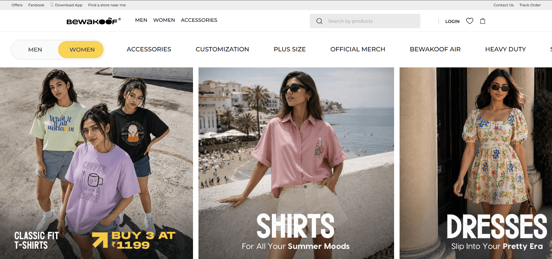

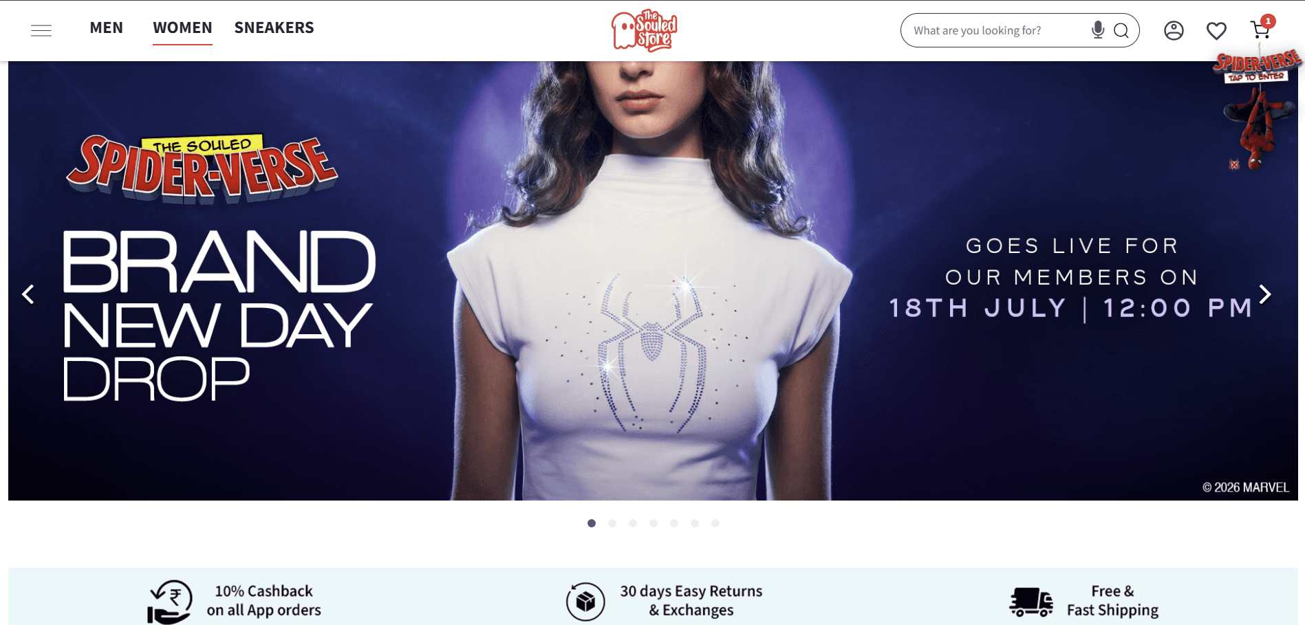

The research didn't give me layouts to copy. It gave me patterns to question and principles to reuse. Familiar patterns reduce learning. My goal wasn't to reinvent them—it was to understand why they work before deciding what to change.
THE DESIGN CHALLENGE
Clothing interfaces aren't passive galleries. They're decision environments.
Every screen asks the user something:
Each question adds cognitive load. The design challenge wasn't about aesthetics — it was about organisation. How do you present dense product information without creating visual stress or decision fatigue?
Removing information wasn't the answer. Missing details create hesitation. The real challenge was structuring complexity, not hiding it.
KEY DECISIONS
Hero Section — First cognitive impression

Most D2C hero I studied tried to communicate everything immediately—offers, collections, categories and promotions.
I wanted the first screen to do something different.
Instead of asking users to make decisions straight away, I wanted it to establish the brand first. That's why I kept the hero intentionally minimal. One model became the visual focus, while the cropped supporting images hinted at the collection without competing for attention.
The goal wasn't to reduce information forever. It was simply to delay it until users were ready.
DECISION 1
Prominent filters, not hidden controls

Many shopping websites keep a full filter panel visible throughout browsing. Instead, I kept only the most frequently used filters visible at the top and moved the rest behind All Filters. For someone casually browsing denim, showing every possible filter immediately adds visual weight before it's useful. The common filters support quick refinement. The advanced filters stay one tap away when needed. The goal wasn't hiding functionality. It was keeping browsing visually lighter.
DECISION 2
Structure information, don't reduce it

The instinct in "clean" design is often to remove information. In e-commerce, that creates more doubt than clarity. Instead of removing details, I focused on deciding what should be seen first and what could wait. Typography, spacing, grouping and visual hierarchy became the tools for reducing cognitive effort—not reducing information.
The interface needed to breathe without feeling empty.
DECISION 3
Persistent order context in checkout

In most checkout flows, once you move from cart to address to payment, the product disappears. The user has to remember what they selected, the price, any offer applied.
That memory gap creates friction and erodes confidence at exactly the moment you need the user to feel sure.
I kept the order summary visible across every checkout step — cart, address, payment. No surprises. No mental load. Users can see everything, all the time.
This wasn't a layout choice. It was a trust mechanism.
WHAT THIS PROJECT CHANGED?
I used to approach screens like compositions — balance, spacing, visual calm.
This project shifted something.
Users aren't just looking at a design. They're making decisions inside it. And decisions come with doubt, comparison, hesitation. The role of design isn't just to make things look clean — it's to make people feel sure.
Every screen in this project was designed around a question: where might a user hesitate here? What information would make this easier? What reduces doubt without overwhelming them?
That shift — from visuals to behaviour — is probably the biggest thing I took forward from this one.
RESULT?
Final Design

The final homepage, where the individual decisions come together into one cohesive shopping experience.
REFLECTION
Looking back, this project raised more questions than it answered—and I'm glad it did.
It challenged many assumptions I had about e-commerce design and made me realise how much thought goes into even the smallest interface decisions. If I were to take this further, the next step would be validating these ideas through usability testing and real user feedback.